There’s a statistic being widely reported across social and traditional media that the policy of austerity pursued by the UK government since 2010 has been directly responsible for 120,000 deaths. That is an alarming number and accusation. Could the UK government really have killed 120,000 people due to its economic policy?
I should say at this point that I have no particular political axe to grind here. I’m no fan of the Conservatives but I’m certainly a fan of good science and using statistics properly. Therefore this blog will take a look at whether the claim of 120,000 deaths due to austerity alone is correct.
First some background. In the 2010 UK General Election the Conservative Party stood on a platform of cutting government spending as a response to the global recession. Following the election their leader David Cameron formed a coalition government with the Liberal Democrats. Cameron became Prime Minister and the Conservative Shadow Chancellor George Osbourne became Chancellor of the Exchequer. Cameron and Osborne then enacted their policy of austerity. The result was a cut in welfare spending of £30 billion. Although spending on the National Health Service was ring fenced against spending cuts the average real terms growth in health spending was 1.1%, much lower than under previous governments. Against this backdrop the claim of 120,000 deaths makes sense. Reduced healthcare spending means reduced healthcare provision. Reduced healthcare provision means more deaths.
Nine years after taking office Cameron and Osbourne still defend austerity. In his recently published memoirs Cameron argues his government should in fact have cut spending more. Osbourne has been dismissive in interviews about the negative impacts of austerity. However, Cameron’s successor as Prime Minister Theresa May claimed she had veered away from austerity and the current Chancellor Sajid Javid has annouced an increase in spending to reverse some of the cuts enacted by Osbourne. Both the Conservatives and Labour are making increased public spending through borrowing a feature of their 2019 election manifestos.
Not surprisingly those on the political left have made much of this figure of 120,000. The left wing journalist Ash Sarkar made a passionate argument on BBC Question Time quoting it. But is it correct?

Screenshot of tweets quoting the 120,000 deaths figure
The figure
Let’s first look at where the figure came from: a BMJ Open article from 2017. In their paper, Effects of health and social care spending constraints on mortality in England: a time trend analysis the authors Watkins et al., looked at death rates between 2011 and 2014 and compared these to the expected trend based on previous death rates.
From Watkins, J., Wulaningsih, W., Da Zhou, C., Marshall, D., Sylianteng, G., Dela Rosa, P., Miguel, V., Raine, R., King, L. and Maruthappu, M. (2017). Effects of health and social care spending constraints on mortality in England: a time trend analysis. BMJ Open, 7(11), p.e017722.
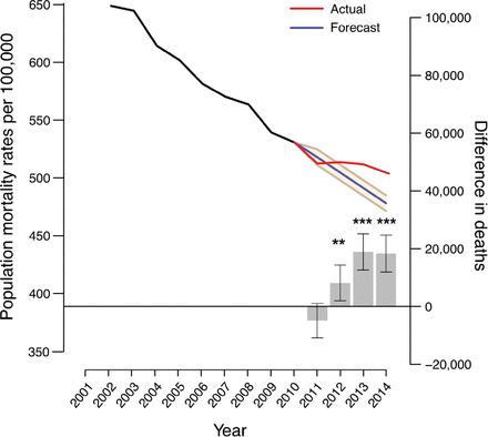
As this graph from the paper shows the authors performed age standardisation, this adjusted for the fact that the British population is made up of people of different ages, and compared the data of 2010-2014 with the previous trend (the blue line). They found that death rates actually went up (the red line) resulting in 45 368 ‘extra’ deaths in those four years. They used this number and extrapolated based on this new trend and found that between 2009 and 2020 there would be “an estimated 152 141 additional deaths.” The authors didn’t just frame this figure within the context of healthcare spending but with social care as well:
“Real-term adult social care spending decreased by 1.19% annually between 2010 and 2014 after correcting for the effect of inflation, reversing the annual increase of 3.17% between 2001 and 2009. This is despite increasing demand, with the group most likely to require social care—the over 85s—set to rise from 1.6 million in 2015 to 1.8 million in 2020.”
The authors also claimed that an additional £6.3 billion extra per year would need to be spend by the government to reverse these extra deaths. Music to the ears of left wing politicians and activists and all of us working in healthcare. As I said above, it seems a reasonable finding. If the government cuts provision for the elderly and sick you would expect to see more people dying. But is it all true?
What has been going with mortality rates?
Firstly, the data and trend reported by Watson et al., (2017) does match data from the Office of National Statistics who also show that the death rates for both genders since 2011 has been above the trend expected based on previous results. In the previous decade there was an overall downwards trend, albeit with brief rises in death rates in both 2003 and 2008, before austerity.

https://www.ons.gov.uk/peoplepopulationandcommunity/birthsdeathsandmarriages/lifeexpectancies/articles/changingtrendsinmortality/acrossukcomparison1981to2016
So it does look like there have been more deaths than expected since 2011. That’s not up for debate. But can we say these were definitely due to austerity? The short answer is no. Here’s why.
This study couldn’t prove causality
This was an observation study. This is a type of study where the researchers don’t actually interfere by changing what the subjects are exposed to. It’s obviously not possible to have some subjects living under austerity and another group not and so there was no randomisation or control group. Therefore it is impossible to use this study to draw a direct causation. An observational study is limited to suggesting a relationship but not cause-effect. There’s a commonly used phrase: correlation does not mean causality. Observational studies are therefore not high up on the hierarchy of levels of evidence.
LIFE EXPECTANCY IS IMPROVING BUT NOT AS FAST AS BEFORE
As we’ve already seen mortality rates have gone up. But what about life expectancy? Again we can look at ONS data.
The ONS divides the rate of increase year on year of life expectancy between the period 2004-2010 and 2010-2016. Between 2004 and 2010 the UK saw a rapid increase in the rate at which life expectancy improved. Only Portugal and the Netherlands saw higher increases in males and only Portugal and Poland saw higher increases in females. However, since 2010 the UK has seen the lowest average annual increase in life expectancy in females and only the US has had a lower average annual increase in life expectancy in males. Japan on the other hand have had the opposite trend with much faster improvements in life expectancy in 2010-2016 compared to 2004-2010.
The UK remains close to France and Germany and despite higher healthcare spending the USA lags in life expectancy

So we know that the UK experienced a rapid rate of improvement in life expectancy in the first decade of the 21st century. Since then life expectancy is still improving but at a slower rate, especially in women. If we look at male life expectancy it has remained comparable to both France (orange) and Germany (grey), two similar countries to the UK (green).
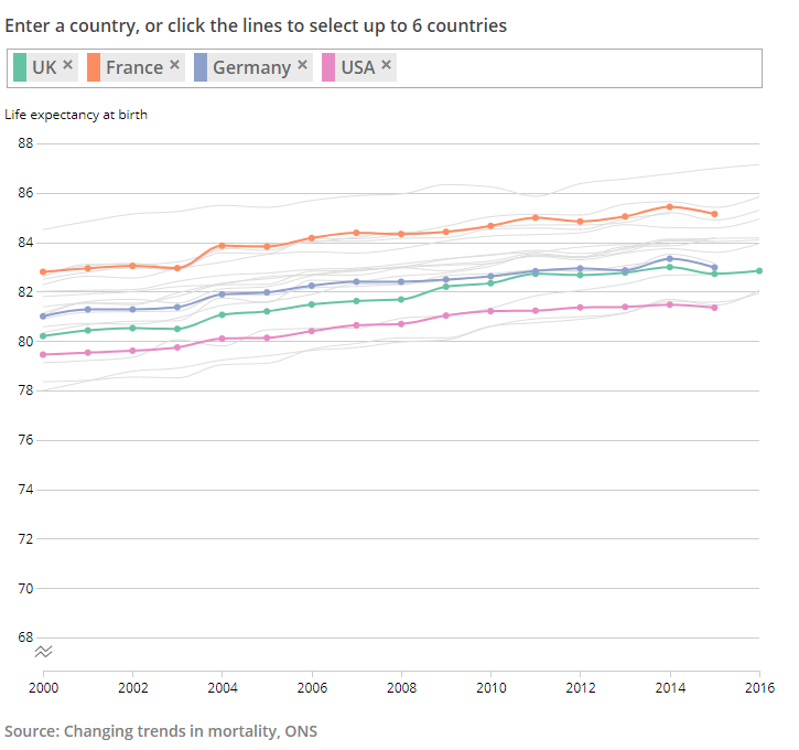
Female life expectancy in the UK has remained higher than in men and has largely caught up with Germany but lagged behind France even before austerity.
Notice how life expectancy in the UK has consistency been higher than the USA, a country with the highest per capita spending on healthcare. Other things must be going on than just spending. And while women may live longer than men why does life expectancy not improve at the same rate for both sexes?
The last few decades have seen improvements in cardiovascular health for older and male patients but also severe influenza epidemics
In the UK death rates from cardiovascular disease have more than halved since it peaked in the 1970s and 1980s. And that rate of improvement has been most prominent in the older age groups with 50% reduction in deaths due to heart disease in the 55-64 age bracket compared to 20% in men ages 34-44. So we’re getting better at preventing deaths due to cardiovascular illness and the most benefit is being seen in older patients. As well as this was an important piece of public health legislation in the UK: the 2007 ban on smoking in public places. Since then the percentage of people smoking in the UK has dropped from 22% to 15%. These are great improvements but the benefit hasn’t been shared out. It is notable that the improvements in cardiovascular medicine and reduction is smoking have benefited men over women. In 1971 women in the UK lived on average 6.3 years longer than men. By 2018 that had fallen to 3.6 years. The gender divide has closed.
In the past decade we have been seeing average increases in deaths due to influenza in the UK:
From The Guardian
2015 saw (at that point) the biggest year to year jump in deaths since 1968. The biggest jump occurred in patients aged over 75. A large contributing factor was that year’s influenza epidemic where antigen shift reduced the effectiveness of the vaccine which had been given. Influenza and other respiratory conditions were reported in a third of deaths in patients with dementia that year. 2017-2018 saw deaths due to influenza triple from the previous year with Public Health England also attributing that year’s particular severe winter to in the increase in deaths. It’s not all bad though. The 2018-2019 winter saw a new influenza vaccine be offered to the over 65s. Although the actual numbers of vaccinated over 65s varied across the UK the 2018-2019 winter saw little excess mortality due to influenza with the greatest health impact being seen in under 64 age groups. Influenza remains a seasonal, and sometimes difficult to predict, series Public Health challenge.
It’s been a pattern of Medicine that we have been increasing life expectancy
At first improvements were seen in reducing child mortality through vaccinations and better treatments for childhood infections. Then, as shown by the data of cardiovascular disease, we’re getting better at getting adults (especially men) to live longer and reduce the rate of heart disease through better treatment and prevention such as the smoking ban. But this means we then have a population of elderly patients who have lived to develop dementia and be vulnerable to the ‘flu.
Another statistic worth mentioning at this point is healthy life expectancy: how many years a person lives in good health free of disability. Whilst this is increasing it is not doing so at the same rate of life expectancy meaning people are living more years in poor health. And this too is favouring men over women. An English male could expect to live 79.6 years in 2015–17, but his average healthy life expectancy was only 63.4 years – i.e., he would have spent 16.2 of those years (20 per cent) in ‘not good’ health. However, in the same year an English female could expect to live 83.1 years, of which 19.4 years (23 per cent) would have been spent in ‘not good’ health.

https://www.theonion.com/world-death-rate-holding-steady-at-100-percent-1819564171
As the satirical Onion put it in one of their articles, “the global death rate remains constant at 100 percent.” People have to die. It’s part of the human experience. So perhaps what we’ve seen since 2010 are some of those deaths we’ve previously been able to prevent but can't now. We’re good at preventing deaths due to heart disease but currently can’t cure dementia. We’ve been pushing deaths back later and later and now we’re seeing them this decade as well as more people (especially women) spending more of their later life in poor health.
So is austerity to blame for 120,000 extra deaths? Yes, during the period of austerity there has been a rise in deaths in the UK. And yes, life expectancy has not been increasing as fast as in the previous decade.
However, we certainly can’t say it’s the sole cause. Firstly, the study linking austerity to those deaths is simply not enough evidence. And much of health improvements in the past few decades has been on increasing the number of adults reaching older age and becoming susceptible to conditions we currently can’t cure such as dementia and frailty. We’ve also seen influenza epidemics which have particularly hit the over 65s. It’s likely that the rise in deaths is a mixture of all of these factors.
But while it is wrong to place sole blame on austerity it is important to talk about healthcare spending and what kind of provision we want in this country. We have an ageing population with increasingly complex needs. That needs paying for one way or another. We may also have to shift how we view modern medicine. Healthcare has been about improving life expectancy, simply adding years to life. A patient not dying and living longer than they would have managed without medical intervention is a success. If we are increasing a patient’s life but they are spending those extra years in poor health there is a philosophical argument: rather than adding years to life should we be looking at adding life to those years left?
Thanks for reading.
- Jamie