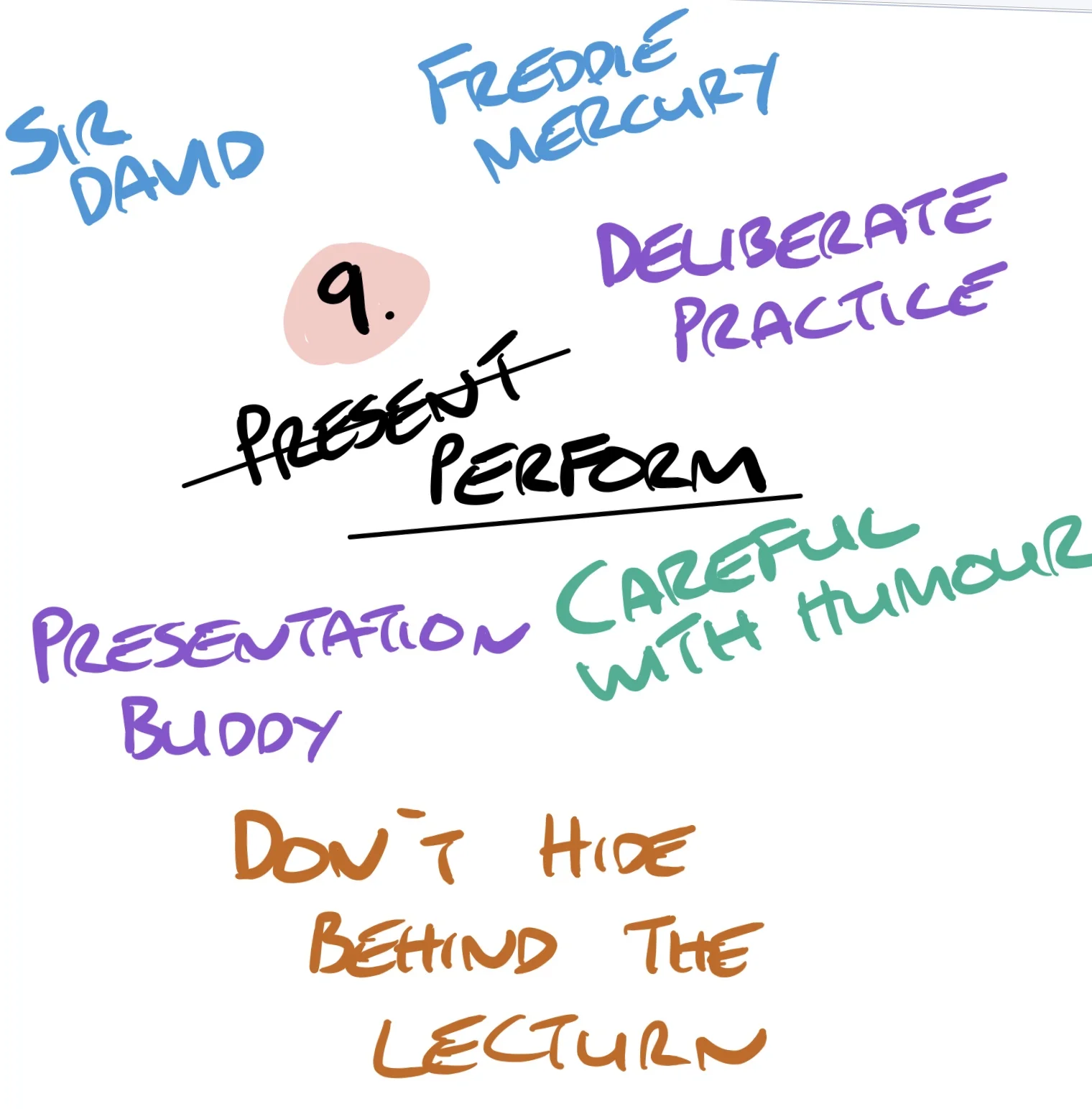
How many times have you been told “I’ve got a presentation you can use” or “I’ve emailed you my presentation”?
What they mean is “I’ve got some slides you can use” or “I’ve emailed you my slides”.
It seems a very pedantic thing to point out but it’s a very crucial point. You are the presentation. The slides are there to help you to give your message. They are not a crutch, they are not there to hide behind or to show off or simply to read off the screen.
I came to this realisation a while after start to work in education. At the time this is an example of the kind of ‘presentations’ I was giving:

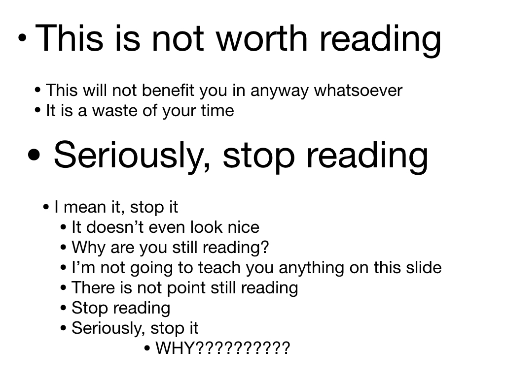
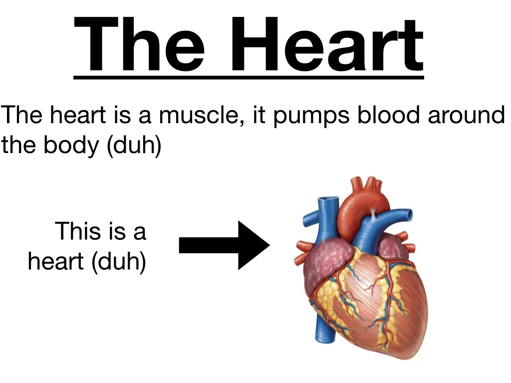
53 words and figures in one cramped slide. What was I trying to do here? The information is correct, it shows the stages of taking a clinical history as well as how to take a pain history. But clearly I was relying on this slide. This slide was the teacher not me. I would read this out to my students and that was teaching in my mind. My students would read along with me and that would be learning in their mind and mine.
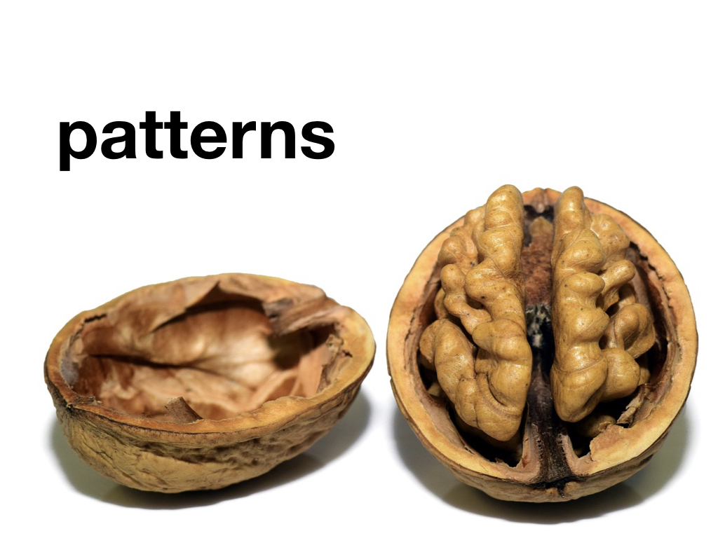
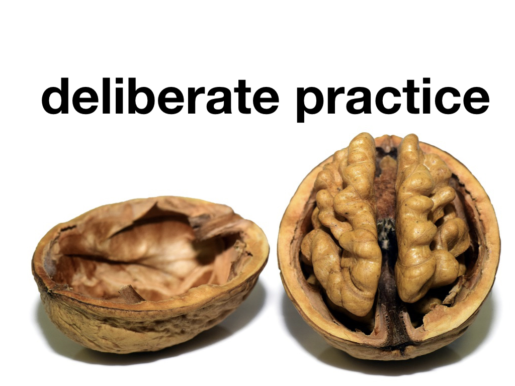
Yet this is an incredibly ineffective way to try and teach. To understand why we have to appreciate Neuropsychology; ‘the brain in a nutshell’:

No one can multi-task. It doesn't matter about your gender or intellect. No one can multi-task. Instead, what we thing of as multi-tasking is actually us moving our attention between two things quickly. This is a difficult thing to do. An example of this is when we drive. We might put the radio on and listen, maybe turn the volume up and sing along. The reason we can do this is if we’re on a regular route or the driving is easy we can switch off a bit and focus on the radio. But what happens if we have to take an unfamiliar route? What happens if we suddenly need to focus more on the road and our driving? If we have to parallel park or make a three point turn? We immediately turn off the radio. That’s because of cognitive load. We only have so much cognitive space to give to any one task. The radio is fun when driving is easy. When we have to focus it’s distracting. This is cognitive overload. The overload is more severe when we are asking more of the same part of the brain. Listening, writing and talking all require the language centre of the brain. Expecting students to listen, read, make notes AND learn is impossible.
Yet we all are guilty of this. Thirty million PowerPoint presentations are made every day. If you’re asked to give a presentation the temptation is to open PowerPoint and start typing away with headings and bullet points before then reading them out to our audience. It makes us feel safe. It shows all our knowledge. It’s convention. We are all the same like characters in the Lego Movie.

But everything is not awesome. To use any tool is to understand its limitations and the danger of using it. And PowerPoint is dangerous. We’ve all sat in those presentations. A speaker with a stream of slides full of text, monotonously reading them off as we read along. We’re so used to it we expect it. We accept it. We even consider it ‘learning’. The only push back we might make is to call it ‘death by PowerPoint’. But we should push back more.
Usually the only victim of PowerPoint is our audience’s attention and inspiration. But there was a PowerPoint slide that actually helped to kill seven people.
In January 2003 the Space Shuttle Columbia launched. During launch a piece of foam fell from the external fuel tank and hit Columbia’s left wing.
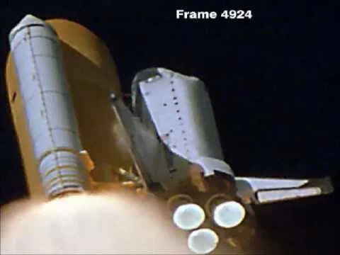
Frame of NASA launch footage showing the moment the foam struck the shuttle’s left wing (Creative Commons)
It was impossible to tell from Earth how much damage this foam, falling nine times faster than a fired bullet, would have caused when it collided with the wing. Foam falling during launch was nothing new. It had happened on four previous missions and was one of the reasons why the camera was there in the first place. But the tile the foam had struck was on the edge of the wing designed to protect the shuttle from the heat of Earth’s atmosphere during launch and re-entry. In space the shuttle was safe but NASA didn’t know how it would respond to re-entry. There were a number of options. The astronauts could perform a spacewalk and visually inspect the hull. NASA could launch another Space Shuttle to pick the crew up. Or they could risk re-entry.
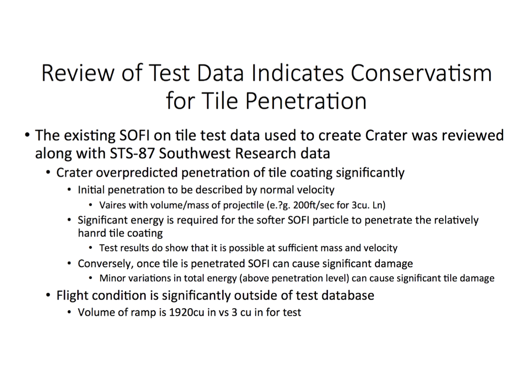
NASA officials sat down with Boeing Corporation engineers who took them through three reports; a total of 28 slides. The salient point was whilst there was data showing that the tiles on the shuttle wing could tolerate being hit by the foam this was based on test conditions using foam more than 600 times smaller than that that had struck Columbia. This is the slide the engineers chose to illustrate this point:
NASA managers listened to the engineers and read their PowerPoint and thought this was learning. Boeing read out their slides and thought this was teaching. NASA decided to go for re-entry.
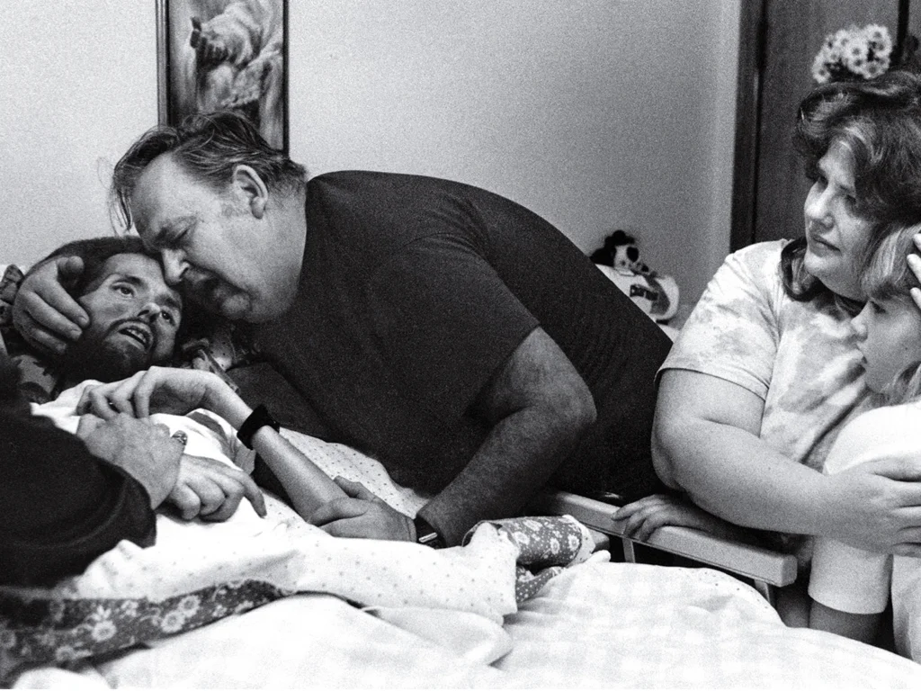
Columbia was scheduled to land at 0916 (EST) on February 1st 2003. At 0912, as Columbia should have been approaching the runway, ground control heard reports from residents near Dallas that the shuttle had been seen disintegrating. Columbia was lost and with it her crew of seven. The oldest crew member was 48.

Edward Tufte, a Professor at Yale University and expert in communication reviewed the slideshow the Boeing engineers had given NASA, in particular the above slide. His findings were tragically profound.

Firstly, the slide had a misleadingly reassuring title claiming that test data pointed to the tile being able to withstand the foam strike. This was not the case but the presence of the title, centred in the largest font makes this seem the salient, summary point of this slide. This helped Boeing’s message be lost almost immediately.

Secondly, the slide contains four different bullet points with no explanation of what they mean. This means that interpretation is left up to the reader. Is number 1 the main bullet point? Do the bullet points become less important or more? It’s not helped that there’s a change in font sizes as well. In all with bullet points and indents six levels of hierarchy were created. This allowed NASA managers to imply a hierarchy of importance in their head: the writing lower down and in smaller font was ignored. Actually, this had been where the contradictory (and most important) information was placed.
Thirdly, there is a huge amount of text, more than 100 words or figures on one screen. Two words, ‘SOFI’ and ‘ramp’ both mean the same thing: the foam. Vague terms are used. Sufficient is used once, significant or significantly, five times with little or no quantifiable data. As a result this left a lot open to audience interpretation. How much is significant? Is it statistical significance you mean or something else?

Finally the single most important fact, that the foam strike had occurred at forces massively out of test conditions, is hidden at the very bottom. Twelve little words which the audience would have had to wade through more than 100 to get to. If they even managed to keep reading to that point. In the middle it does say that it is possible for the foam to damage the tile. This is in the smallest font, lost.
NASA’s subsequent report criticised technical aspects along with human factors. Their report mentioned an over-reliance on PowerPoint:
“The Board views the endemic use of PowerPoint briefing slides instead of technical papers as an illustration of the problematic methods of technical communication at NASA.”
PowerPoint is not an effective form of communication. We wouldn’t stand at a board writing out hundreds of words and expect our audience to follow us so we shouldn’t do the same with our slides. We have to be aware of the risks of PowerPoint because when we open it up we are presented with a host of templates with obscure backgrounds and hard to read text, making it very easy to fall into the same traps:

There are a number of formulas out there suggested as ways of giving good presentations. One is the 6x6 rule: no more than 6 lines on a slide, no more than 6 words per line. That is still 36 words. Far too much. Another is the 20 20 rule - 20 slides 20 seconds per slide. Why would you do this? If you only need one slide use one slide. If you don’t need slides, don’t use them.
Let’s remember the crew of Columbia every time we prepare our slides.
Keep it simple.
Your slides are there to help you give your presentation and share your message. if not used properly they actually will hurt your presentation and help your message be lost.
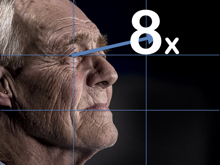
Use one point per slide. Lists don’t work. For example here’s the first twenty elements of the periodic table:

I’ll read them out and you’ll read with me. What’s number eight? You'll have to look back to check. Even though you’ve just read a list you’ll remember the first and last and little in between.

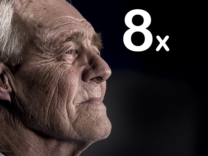
One point per slide. What’s the eighth element? You won’t have to look back now.
Respect cognitive load.
Lists are for shopping not for slides.
One point per slide - you don’t need headings.

Bullets are for guns not for presentations.
slides ≠ presentation
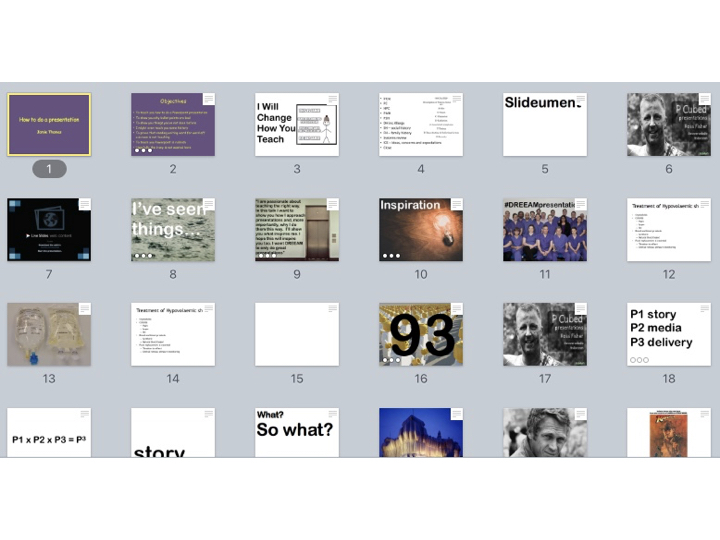
It’s easy to just open PowerPoint and write words and words onto a screen. These 22 slides took me 30 minutes:
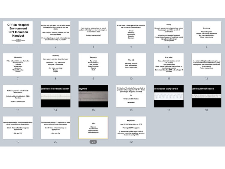
But this is not a presentation. These aren’t slides intended to be used in a presentation. Your slides shouldn’t be a stand alone document. This is a handout.
Realising this point changes how we approach a presentation immediately. People don’t want to watch you reading off a slideshow just as people don’t attend concerts to listen to a recorded album. They come to watch a band perform. Your audience are there to watch you perform.
A presentationalist knows that PowerPoint kills. A presentationalist uses slides only if they help the presentation. If they’re not needed they’re not used. Simple.